Creating a compelling PowerPoint presentation isn’t just about sharing content—it’s about visually communicating your brand identity. Whether you’re a startup, a non-profit, or an enterprise company, every slide in your deck should reflect your unique voice and values. When designed effectively, your PowerPoint template becomes a consistent brand asset, strengthening recognition, professionalism, and trust among your audience.
This article outlines a detailed guide on how to incorporate your brand into a PowerPoint template, from visual elements to storytelling techniques, ensuring that your brand shines through every slide.
1. Understand Your Brand Identity First
Before opening PowerPoint or thinking about colors and fonts, you must understand your brand identity. This includes:
-
Brand Values: What does your brand stand for?
-
Brand Personality: Is your brand formal or playful? Bold or minimalist?
-
Visual Style: Do you use muted tones or vibrant colors? Geometric patterns or hand-drawn illustrations?
Make sure you have access to your brand guidelines. If they don’t exist, develop a basic style guide outlining your logo usage, color palette, typography, imagery style, and tone of voice. This document will serve as your design blueprint.
2. Use Your Brand Colors Strategically
Colors are one of the most powerful visual identifiers of a brand. When customizing a PowerPoint template, ensure that your primary and secondary brand colors are incorporated throughout.
-
Backgrounds and Shapes: Use your primary colors for slide backgrounds, section headers, or banners.
-
Text and Icons: Apply secondary or accent colors to titles, subtitles, or graphical icons.
-
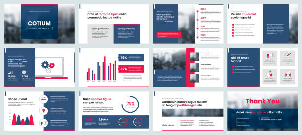
Charts and Graphs: Customize the default chart styles so bars, lines, and pie segments reflect your brand palette.
Avoid using too many colors at once. Stick to three or four colors for consistency and visual harmony.
3. Choose Fonts That Represent Your Brand
Typography is another fundamental element of brand recognition. If your brand uses specific typefaces, ensure they are used consistently across all slides.
-
Title and Header Fonts: Use your primary brand typeface for titles to maintain a strong identity.
-
Body Text Fonts: Choose a font that complements your header font and maintains readability.
-
Fallback Fonts: If your brand fonts aren’t available to all users, select similar system fonts to maintain a consistent look even when shared externally.
Always embed custom fonts into the presentation or provide a PDF version to avoid formatting issues.
4. Incorporate Your Logo Thoughtfully
Your logo should be visible but not overpowering. Common placement includes:
-
Corner of Every Slide: Typically the bottom right or top left.
-
Title Slide Only: For a minimalist approach.
-
Closing Slide: Reinforce brand identity as you finish the presentation.
Use high-resolution versions of your logo, and create variations (e.g., white or transparent background) to fit different slide backgrounds.
5. Design Custom Slide Layouts
Instead of relying on generic slide designs, create custom layouts that reflect your brand’s personality.
-
Title Slides: Design an impactful cover with bold branding, key visuals, and a clean headline.
-
Content Slides: Use consistent margins, grid systems, and visual hierarchy.
-
Section Breaks: Develop branded section dividers using your color palette, fonts, and icons.
-
Data Slides: Customize tables, charts, and infographics to match your branding.
Once done, save these as master layouts in the Slide Master view, so you can reuse them with consistency.
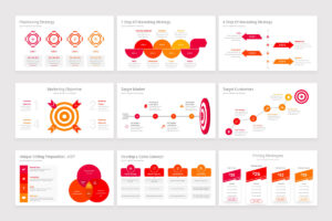
6. Use Branded Icons and Graphics
Icons help convey complex ideas visually. Rather than relying on default PowerPoint icons, use branded icon sets aligned with your style—whether that’s flat, outline, 3D, or animated.
-
Custom Illustrations: Incorporate hand-drawn or vector-style graphics that resonate with your brand voice.
-
Photographic Style: If your brand uses photography, define the tone—e.g., high contrast, natural light, candid shots—and stick with it throughout.
Use consistent line weights, colors, and sizes for a polished appearance.
7. Align Slide Transitions and Animations with Your Brand Personality
Subtle animations can reinforce brand personality when used effectively.
-
Professional Brands: Stick with simple fades and wipes.
-
Creative Brands: Consider more dynamic or playful transitions.
-
Conservative Brands: Avoid excessive animation to maintain credibility.
Ensure that animations support content delivery, not distract from it.
8. Tell a Branded Story
Incorporating your brand isn’t just about aesthetics—it’s also about storytelling. Use brand tone, voice, and values throughout your narrative.
-
Opening Slide: Start with a tagline or mission statement.
-
Body Slides: Structure content with a logical flow that mirrors your brand’s communication style (e.g., authoritative, empathetic, fun).
-
Closing Slide: Reinforce your call to action with strong brand messaging.
A branded presentation should feel like an extension of your website, marketing material, or product.
9. Embed Branded Templates into Your Workflow
Once your PowerPoint template is branded:
-
Save as a Theme (.thmx): This makes it easier to reuse colors, fonts, and layouts across future decks.
-
Distribute Internally: Share it with your team to ensure brand consistency across all presentations.
-
Train Employees: Offer short tutorials or documentation explaining how to use the template effectively.
This minimizes off-brand presentations and ensures visual alignment across departments.
10. Test on Different Devices and Formats
Always preview your presentation on various devices—laptops, projectors, tablets—to ensure colors, fonts, and layouts render correctly.
-
PDF Export: Ensure that all elements stay aligned when saved as PDF.
-
PowerPoint Online: Some animations or fonts may not behave the same as in desktop versions.
-
Aspect Ratio: Design for the correct format (16:9 or 4:3) based on how the deck will be presented.
Brand integrity can be compromised if the deck doesn’t display as intended.
11. Keep It Clean and Consistent
Consistency builds trust. Make sure every slide looks like it belongs to the same family.
-
Whitespace: Give elements room to breathe.
-
Alignment: Use consistent placement for titles, logos, and body text.
-
Repetition: Repeat visual cues like color blocks, lines, and icon styles.
Even if the design is subtle, it should unmistakably reflect your brand’s DNA.
12. Use Templates as Brand Ambassadors
Branded PowerPoint templates are more than tools—they’re ambassadors of your brand message. Whether pitching to investors, presenting to clients, or training your team, a well-branded template does the heavy lifting of visual storytelling, professional tone, and memorable identity.
PowerPoint Templates built with brand integrity allow you to:
-
Communicate more clearly and confidently.
-
Present a polished and professional image.
-
Reinforce your brand message with every visual and word.
They also save time and ensure consistency, reducing the need to start from scratch or worry about formatting for every presentation.
Final Thoughts
Branding your PowerPoint template isn’t just about design—it’s about alignment. Alignment between your visual identity, your message, and how your audience perceives you. By customizing layouts, fonts, colors, and imagery, you ensure that every slide speaks your brand’s language. And when your presentation looks and feels consistent, it helps your message land with greater impact.
Whether you’re a designer or a business owner, investing time in developing branded presentation materials can enhance your storytelling, establish authority, and leave a lasting impression. Think of your template as a brand canvas—and use every slide to paint a picture your audience won’t forget.