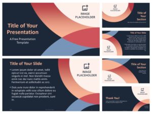
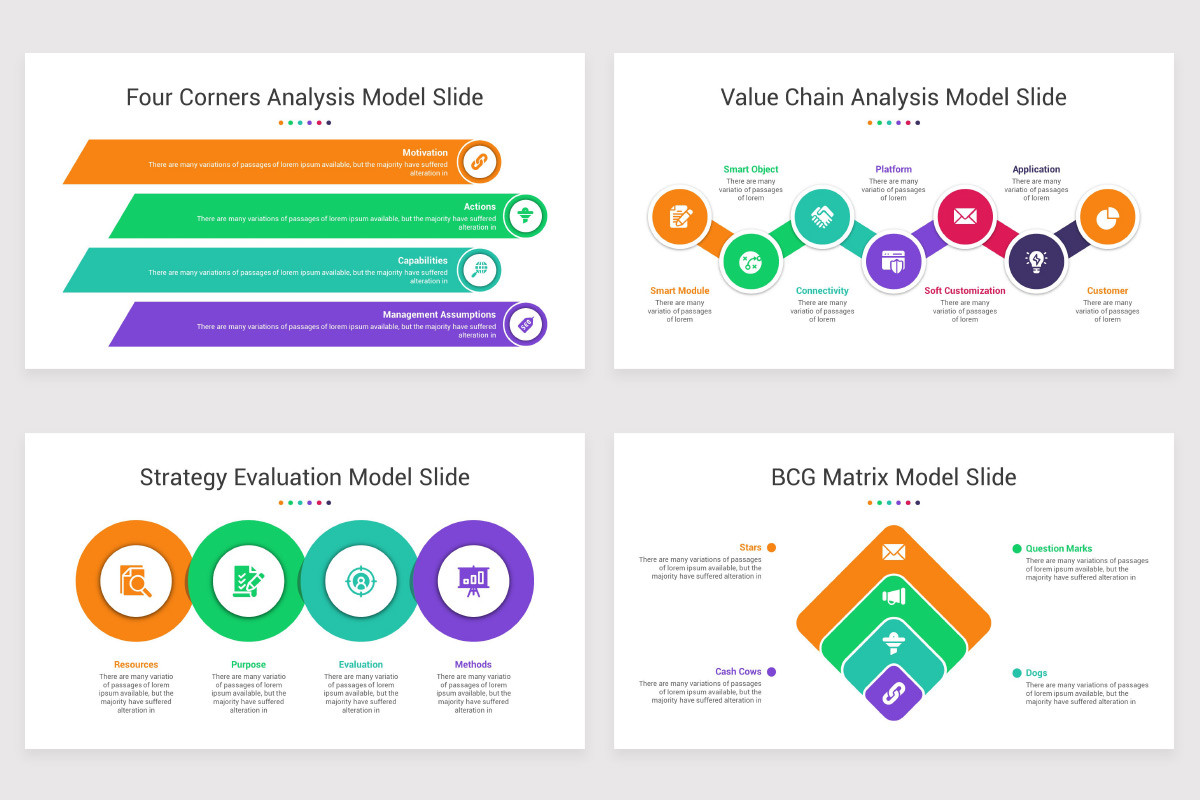
Color is far more than just a visual element in a presentation—it is a powerful psychological tool that can shape perception, influence emotions, and guide the viewer’s attention. When creating PowerPoint templates, understanding how to harness the principles of color psychology can make your designs more impactful and purposeful. Whether you’re aiming to sell a product, explain a concept, or persuade an audience, the colors you choose are silently working behind the scenes to support—or undermine—your message.
This article explores how to effectively use color psychology in PowerPoint template design to create engaging, memorable, and persuasive presentations.
Understanding the Basics of Color Psychology
Color psychology is the study of how colors influence human behavior and emotion. Each color carries certain associations, which are often culturally ingrained and emotionally rooted. These associations can be subtle or powerful, and when applied correctly, they can enhance your communication strategy.
Let’s look at a few common color associations:
- Red: Excitement, urgency, power, and passion. Red is great for calls-to-action but can be overwhelming if overused.
- Blue: Trust, calmness, professionalism, and reliability. It is frequently used in corporate presentations and healthcare sectors.
- Green: Growth, nature, balance, and prosperity. Green works well for eco-friendly themes or financial topics.
- Yellow: Optimism, clarity, warmth, and creativity. While energizing, too much yellow can cause visual fatigue.
- Orange: Enthusiasm, creativity, friendliness, and energy. It strikes a balance between the urgency of red and the cheer of yellow.
- Purple: Luxury, wisdom, imagination, and spirituality. Purple often feels upscale and sophisticated.
- Black: Elegance, authority, modernity, and formality. Best used sparingly to create high contrast and boldness.
- White: Simplicity, cleanliness, and neutrality. It allows other elements to stand out and gives the presentation space to breathe.
Understanding these associations can guide your color choices to suit the purpose and tone of your presentation.
Choosing the Right Color Palette for Your Message
Your message dictates your color choices. A presentation aimed at educating employees on safety procedures will need a different palette than one pitching a new luxury product to investors. Think of your colors as non-verbal cues—they set the emotional tone before your audience even reads a word.
For example:
- Educational Presentations: Use blues and greens to foster calm and trust.
- Sales Presentations: Use warm colors like red and orange sparingly to draw attention to calls to action.
- Financial Reports: Lean on blue and gray to emphasize professionalism and seriousness.
- Creative Proposals: Use purples, yellows, or even teal to signal creativity and innovation.
Avoid overcomplicating your palette. A good rule of thumb is the 60-30-10 rule: 60% dominant color, 30% secondary color, and 10% accent color. This approach maintains balance and prevents visual overload.
Using Color to Highlight and Organize
In PowerPoint design, color can be a critical tool for visual hierarchy. It helps guide the viewer’s eye to the most important elements first.
- Highlighting: Use your accent color to draw attention to key facts, headings, or calls to action. For example, a red accent on a “Next Steps” button ensures it stands out from the rest of the content.
- Segmentation: Assign different colors to sections of your presentation. For example, using a different background tone for each chapter slide helps audiences mentally shift gears.
- Consistency: Maintain consistent use of color throughout your template. If a green box always indicates a success metric, keep it that way from slide to slide to build intuitive understanding.

Contrast and Readability
A beautiful color palette can still fail if it compromises readability. High contrast between background and text is essential, especially in large presentations. Always test your combinations for readability—dark text on a light background or vice versa generally works best.
For instance:
- White text on a dark blue background is professional and readable.
- Black text on a light gray background is neutral and easy on the eyes.
Avoid using similar tones together, such as yellow text on a white background, which can be hard to read under normal lighting conditions.
Emotional Consistency Across Slides
Colors should not only match the content on individual slides but also support a unified emotional tone throughout the presentation. Changing color palettes too frequently can distract and confuse the audience.
Let’s say you are designing a pitch deck. If the first few slides use a confident blue tone to establish credibility, suddenly switching to bright oranges for the financials can feel jarring. Instead, use the established palette in creative ways—perhaps use a different saturation or introduce a subtle gradient—to add variety without abandoning cohesion.
Cultural Considerations
Color meanings aren’t universal. While white signifies purity in many Western cultures, it’s often associated with mourning in some Eastern cultures. If your presentation is aimed at an international audience, do a quick cultural audit to ensure your color choices won’t cause confusion or offense.
For global companies, using more universally accepted colors like blue or green can reduce cultural friction. Alternatively, you can adapt regional versions of your PowerPoint templates, with localized color schemes appropriate to each audience.
Using Neutral Colors as Anchors
Neutral colors like gray, white, and beige may seem boring, but they are critical in letting your vibrant colors do their job. Think of neutrals as visual “silence”—they reduce clutter, improve contrast, and help focus attention.
A slide that features a white background with a splash of turquoise to highlight a key stat is often more effective than one covered in gradients and vivid backgrounds. Use neutrals to create breathing room, especially in content-heavy slides.
Tools to Choose and Apply Color Schemes
If you’re not confident about your ability to create color palettes from scratch, numerous tools can help:
- Adobe Color: Offers harmony rules to create balanced color schemes.
- Coolors.co: Lets you generate and lock palettes based on random exploration or fixed choices.
- PowerPoint’s built-in themes: Microsoft includes color themes that follow good design principles. You can modify these to align with your brand or message.
When customizing a PowerPoint template, always save your color scheme as a theme so you can easily apply it across slides without manually adjusting each one.
Testing and Feedback
Design is never a one-and-done process. Before finalizing your presentation, test it in different settings: on projectors, laptops, and mobile devices. Colors can shift under different lighting or display technologies. What looks vivid on your screen might appear dull on a projector.
Gather feedback from others, especially if you’re presenting to a high-stakes audience. Ask whether the colors feel appropriate for the tone and whether the contrast aids or impedes readability.
Final Thoughts
Integrating color psychology into PowerPoint template design is a subtle yet powerful way to elevate your presentation. Thoughtful use of color can reinforce your message, enhance visual clarity, and improve audience engagement. It’s not about simply making your slides “look nice”—it’s about communicating more effectively.
By being intentional with your color choices, considering your audience’s expectations, and aligning your palette with your content goals, your presentation can move from merely informative to emotionally resonant. Whether you’re pitching a startup, sharing research, or teaching a class, color is one of your most versatile tools—and when used with care, it can make your message unforgettable.
When selecting tools or services to support your presentation needs, consider how they address these design fundamentals. For instance, choosing pitch deck design services that incorporate color psychology ensures your templates not only look professional but also communicate with impact.
